
LO 3 • DESIGN
Context
We got the assignment to brand the Soundlab for Fontys. After gathering information about our client we started working on a colour palette first. This was mine:
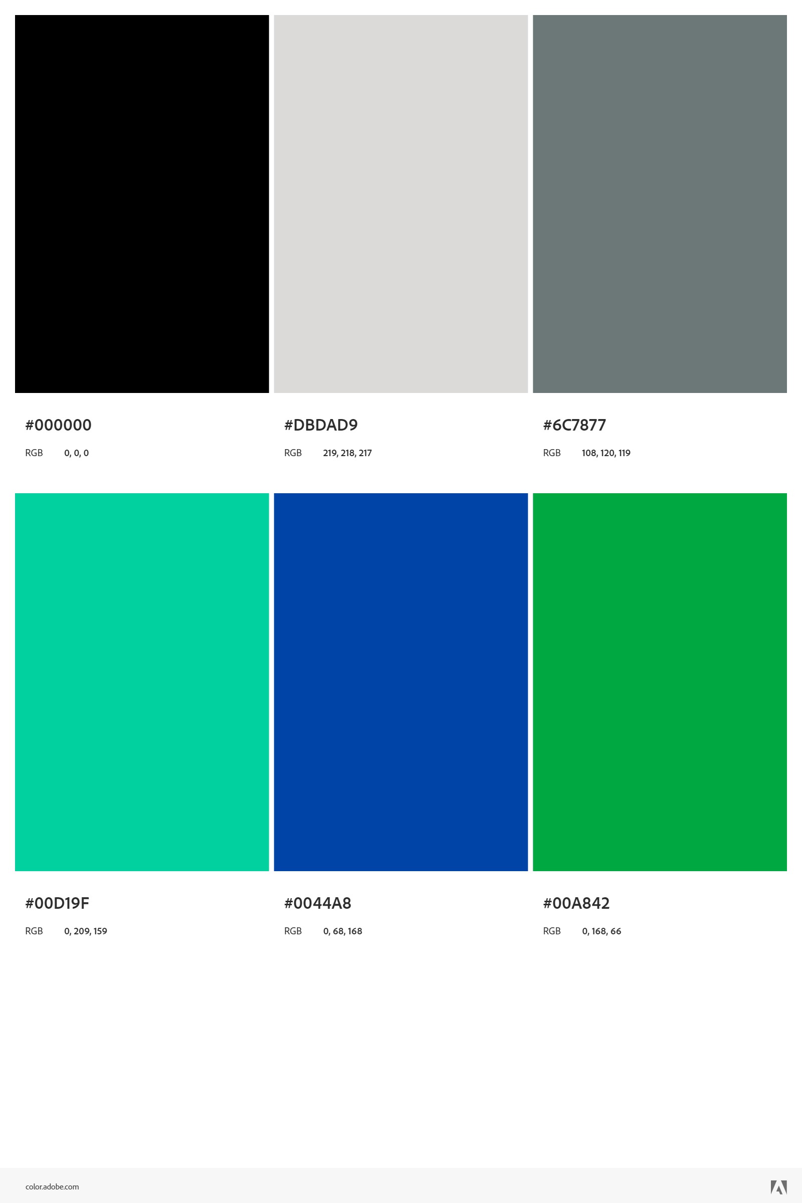
It was based on the complimentary colours of the video lab:
We also started on creating logos, I already had a design idea in my mind because we had come up with the name "Beat Box". This was the first idea I had:
However, after showing this to my peer, they suggested to add a visual element to the logo that had a correlation to sound, so I made this:
After showing this to my client, they said that it looks good, but said it wouldn't look good if it gets smaller. Because of the thin lines it did look worse when you resized it to a smaller size.
So I made the box thicker and then started to experiment with the weight of the font and maybe adding some colours:
After showing this to multiple peers, they liked the colourless, overall thicker/bolder version more. However I also asked my cousin that finished the exact same study and he liked the version with the red top.
But because the majority liked the overall thicker/bolder version more I went with this one as my final one:
However, when I asked feedback on the previous logo, my client told me to ask the target audience and not them. As they wanted it to appeal to the target audience and not themself. So I put my logo in a questionnaire with all the other logos my project group made and interviewed some people. My peers also did their own interviews. You can find the interview in 'Professional Standard: Interview for Soundlab'.
After a better understanding of our target group's preferences of colour and logo types, we all made new ones. This is my colour palette:
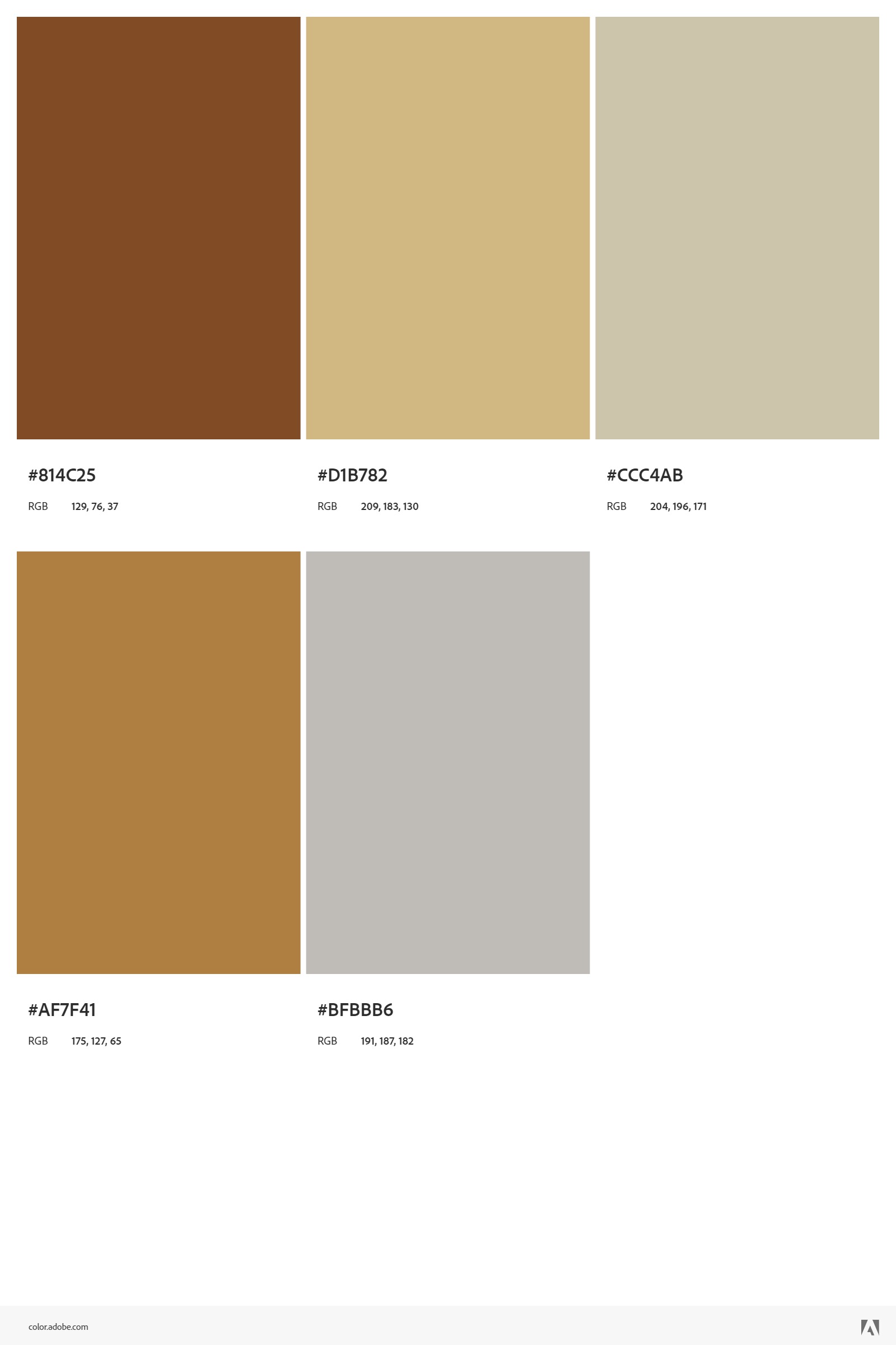
I chose these colours as it was similar to the ones preferred by the target audience.
And this was the first version of the new logo (kind of resembles my portfolios colours coincidentally):
I then made it bigger as I had the same problem with my old logo (could get lost if resizing to a smaller size.):
I showed it to a peer and they said that something felt off. After asking more about what was off they said it didn't feel centered and therefore didn't 'feel' nice.
So I started working on it and made the word "Beat" more centered:
This was my final design of this logo as my other peers liked it.
Reflection
I really enjoyed the whole process. I was happy with the way I asked feedback and improved based on the feedback. This also made my versions look better. There wasn't anything that I can think of that went bad. The only thing that sucked was the fact my logo didn't get chosen by my target audience in the survey.
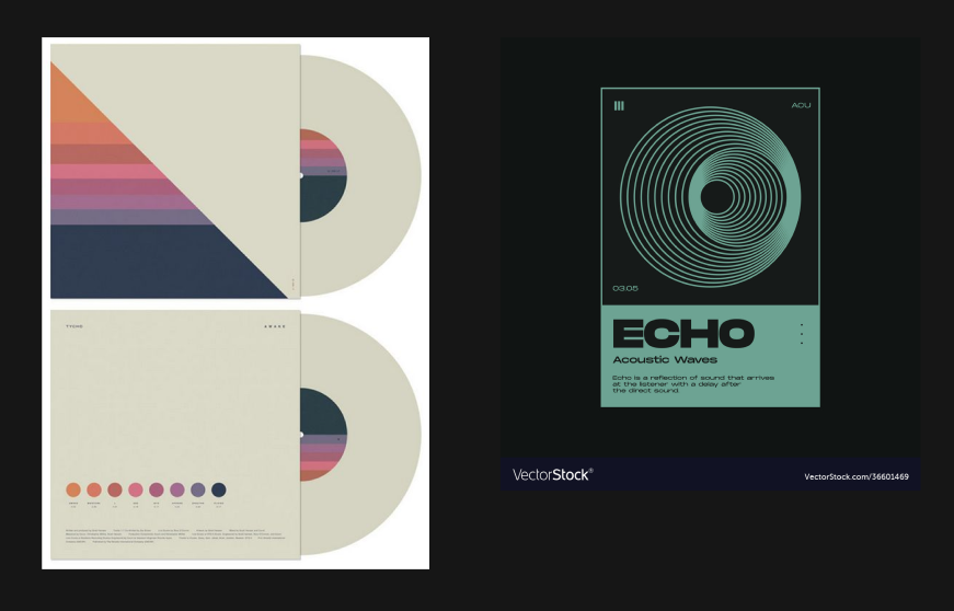
We also had to make a poster for the soundlab, everyone in my own group made one including me. I took inspiration from this:
This was my first version:
After showing this to my parents, they said it was an unique idea, however the 'Tracklist' was hard to read with the black on brown.
So I changed the background to a lighter colour:
After showing them the new poster, they said it looked much better but the discs looked bland/boring.
So I changed them:
After showing them this version they said it looked good now and they didn't have any feedback anymore. So I just decided on that one.
Reflection
I was genuinely very satisfied with the results and very proud of it because I made it from scratch and that's why it felt like it kept missing something, however I was figuring it out slowly (shadows for example) and it made it so much more fun while designing. Loved every bit of it.
After making my design for my website, I was also making some background decorations to make it less 'bald'. While doing so I was experimenting a lot in Illustrator and I had seen many cool videos and tutorials on Instagram about Illustrator.
So, I tried them out in Illustrator and I learned a lot of new things. So I had the idea of creating a poster, because I wanted to make one and I had an idea in mind.
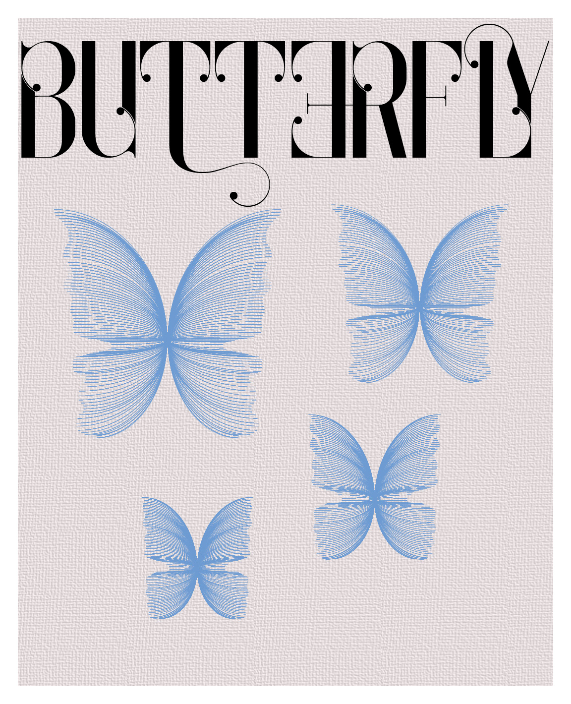
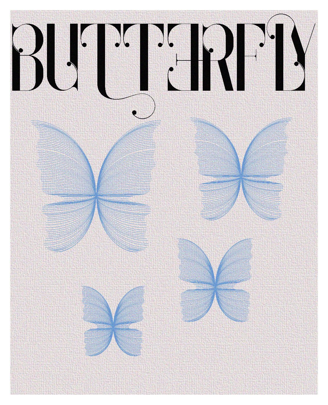
While experimenting I made a butterfly out of lines. And it seemed the perfect element to go on a poster. I had also seen many cool fonts via Instagram so I had the perfect font for the title as well. So I started to work on it:
I then proceeded to add some grain to the background because of personal preference:
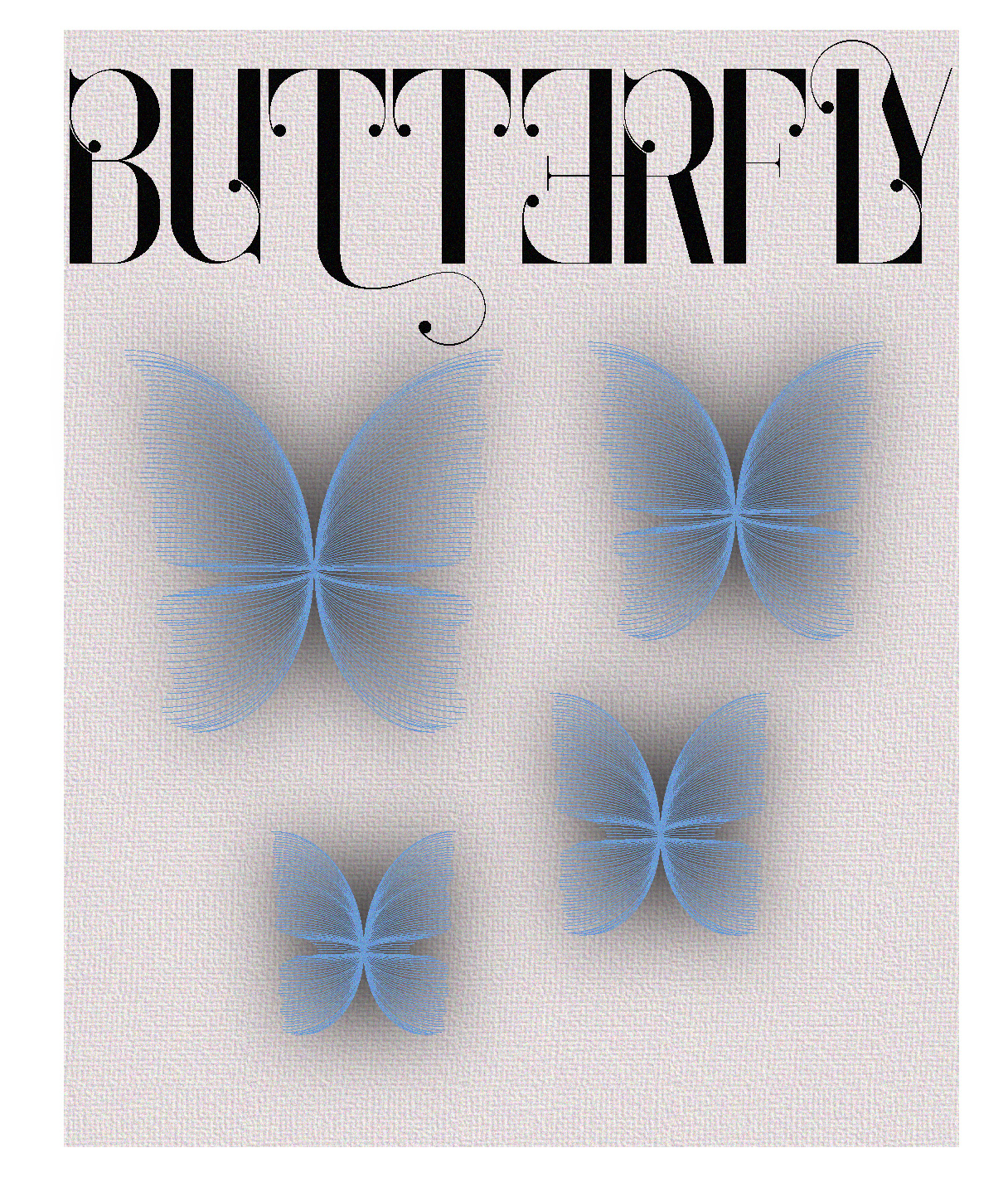
I then added shadows, at first it looked weird but after I tweaked the settings a little it gave it a very cool effect:
Changed the colours to my liking:
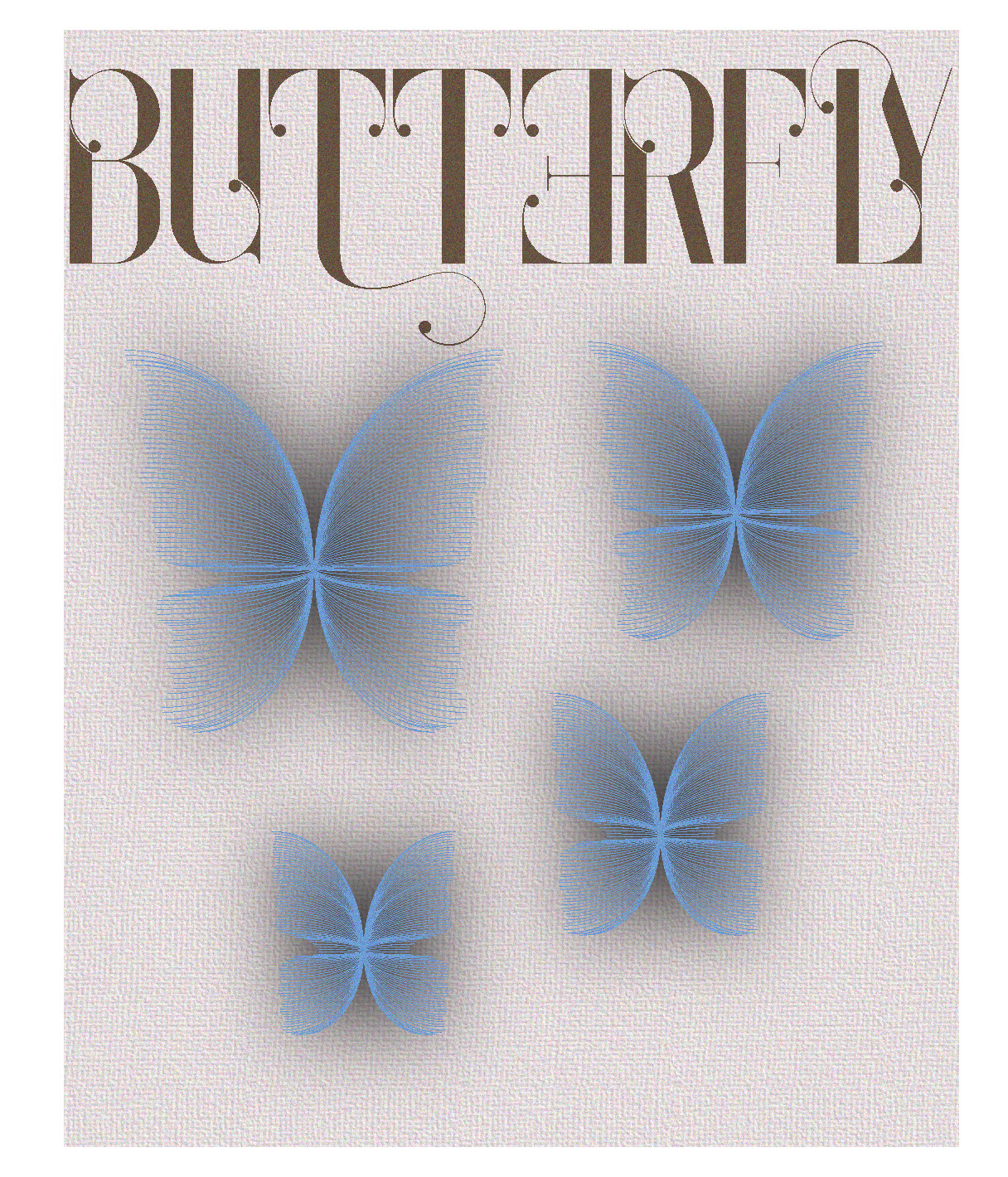
Then I resized some stuff to make everything look more balanced and this was the finished poster:

Reflection
This made me learn more about Adobe Illustrator and also made me realise what I like to do: being creative and making artwork. However, I didn't ask for feedback during this project which I regret. I understand that I need to ask feedback for iterations and I didnt do that here unfortunately.