
LO 1 • INTERACTIVE MEDIA
Context
Of course, before making this website I made a sketch (which you can find in the next module on this page) and did some research on some current trending/popular portfolios. You can read the research in the "Professional Standard" section, under "Portfolio Research".
This is the link to my figma. You can see the raw process there.
The process
This is how I started designing my portfolio:
I first started sketching some website homepage examples I had in my head after doing research and viewing other portfolios, and then chose the one that I liked most.
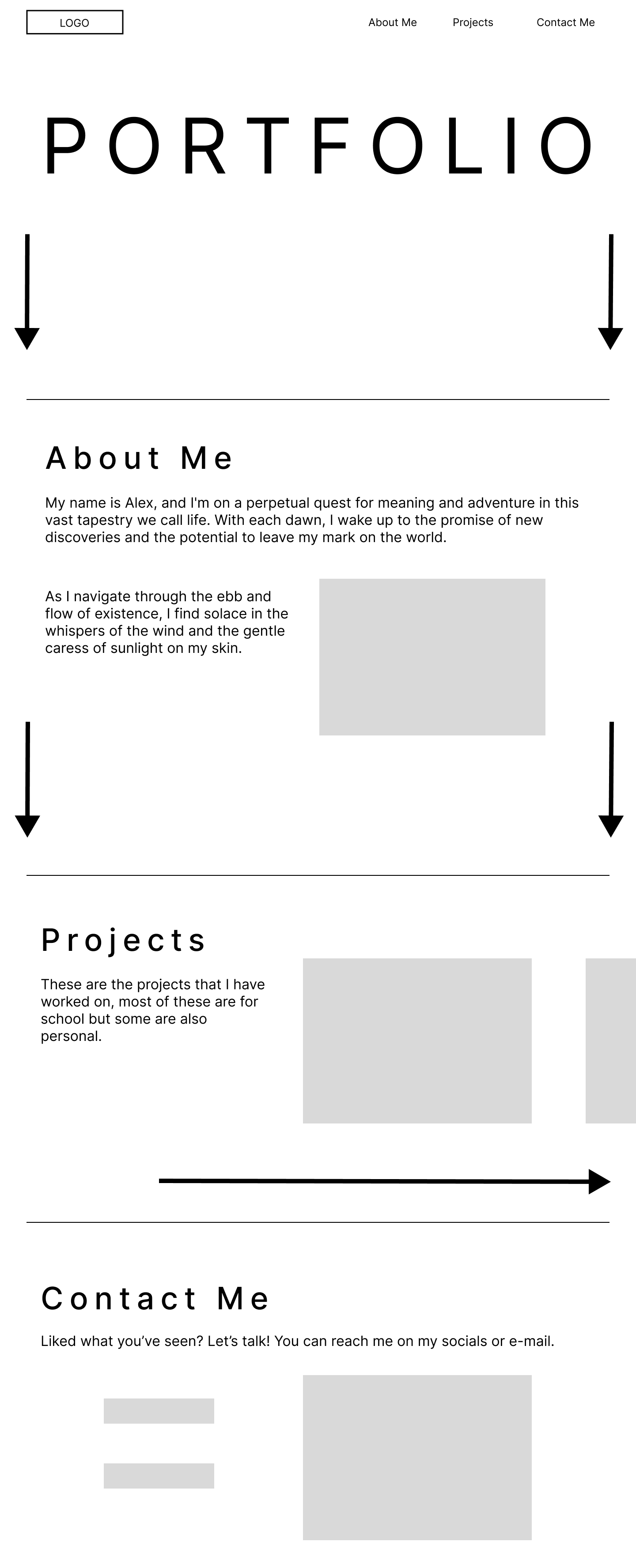
After that I started making a rough design on Figma of the chosen sketch to get a clearer and better view on the design:
Feedback
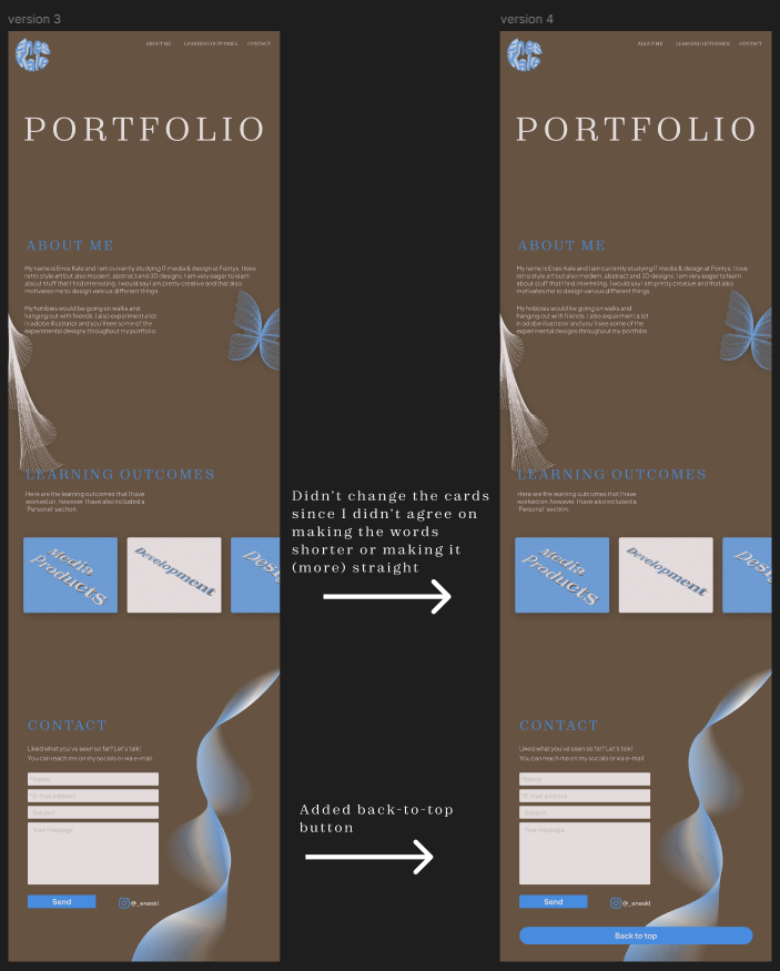
This is what I showed at my first Portfolio Review. So, I got some feedback on it:
- Add your personal touch
- Make it easy to navigate for the teachers
- Check your portfolio structure
- Check if the trends are not a 'gimmick' but an actual trend
First reflection
After getting feedback it turned out that I should make the projects-page more accessible and that I should add more personalized elements into my portfolio. And also, if I apply all of these “popular” design choices, then what would be unique or different about my portfolio than others? Meaning it would be the 'same' and could be seen as boring but modern. Do I want to make that sacrifice?
In my case, no; I am a creative and imaginative person. So sacrificing that for a complete modern look would be wasteful. So, I started making my own colour palette that I personally like, to make it more to my own taste. And also, to be different than most portfolios. So, I tried to achieve an old-school/retro/2K look with colours that wouldn't be “too much” meaning too flashy or too distracting.
The process
Around this time I was very interested in Adobe Illustrator and designing in general, plus it was during the branding project as well. So I just had the idea of making my own "brand". So I started to think on a theme: old-school/retro/2K as I personally love those styles and I wanted it to reflect it throughout the design of my portfolio.
I started to make a colour palette with the help of a tool that I found online called https://www.khroma.co/. The website utilizes A.I. to pair colours that you would like. You first select 50+ colours that you like and based on your selection it makes combinations and you can choose the one you like. That's how I got my two main colours:
But after thinking about only using two colours, I thought it would be too bland and boring and that wouldn't accurately represent me.
So I started looking for an accent colour, I used the website https://huemint.com/. You put in your two colours and then it generates accent colours that would go well with the chosen colours. Of course, I chose a colour that I personally like, however I couldn't make a choice between 3 colours:
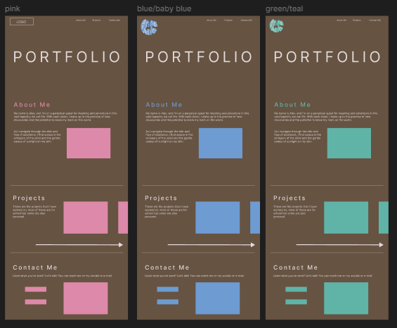
I went with the blue theme as I liked it better and I asked some peers and they agreed.
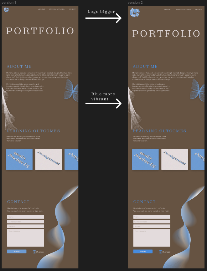
So I made my first version. The images show the changes made.
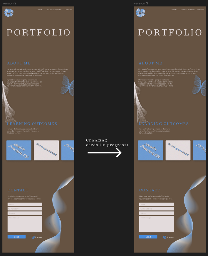
The last one is the up-to-date version
Reflection
I liked working on my "own" website, making your own colour palette, theme, logo etc. just gives so much freedom. Everything went smooth and well.
Context
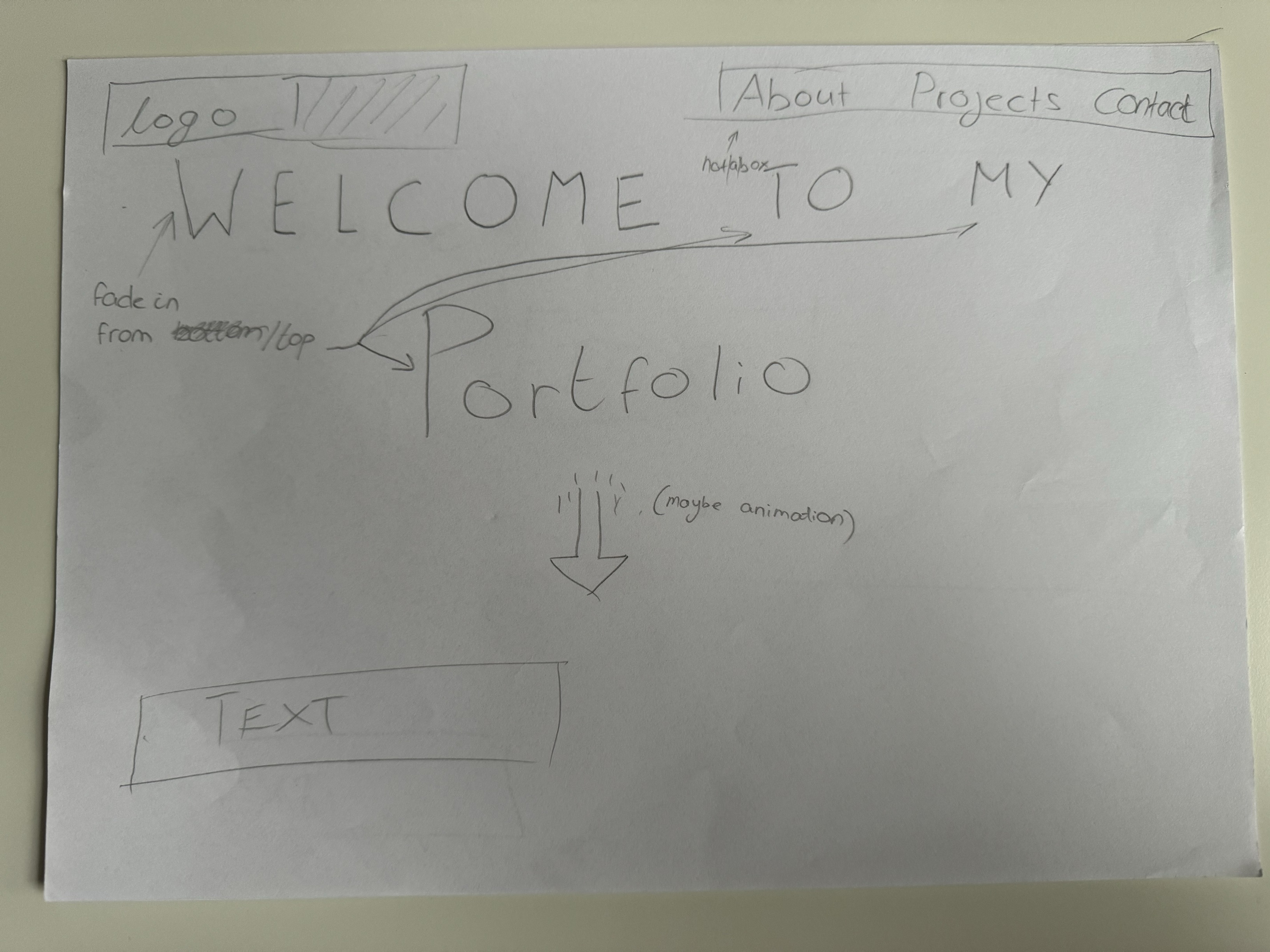
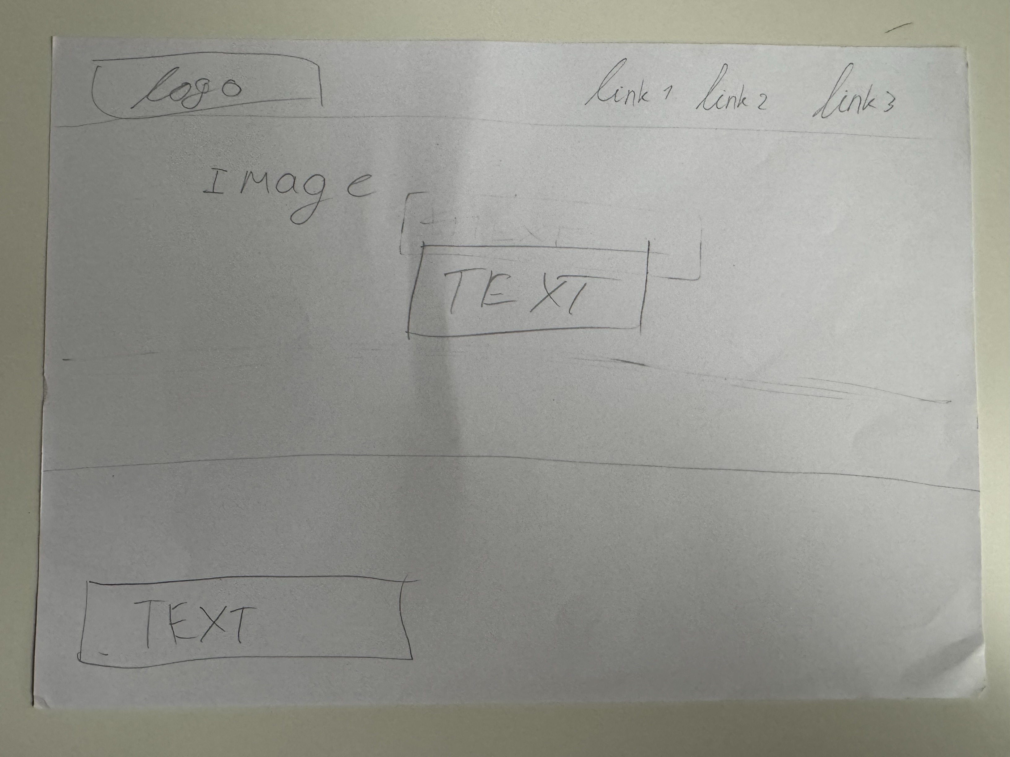
To start deciding on a design, I started experimenting a little based on what I have seen so far on the websites. It will be a one-page design but the most important part about the website is the beginning. You want it to look attractive so it grabs their attention. These are the sketches:
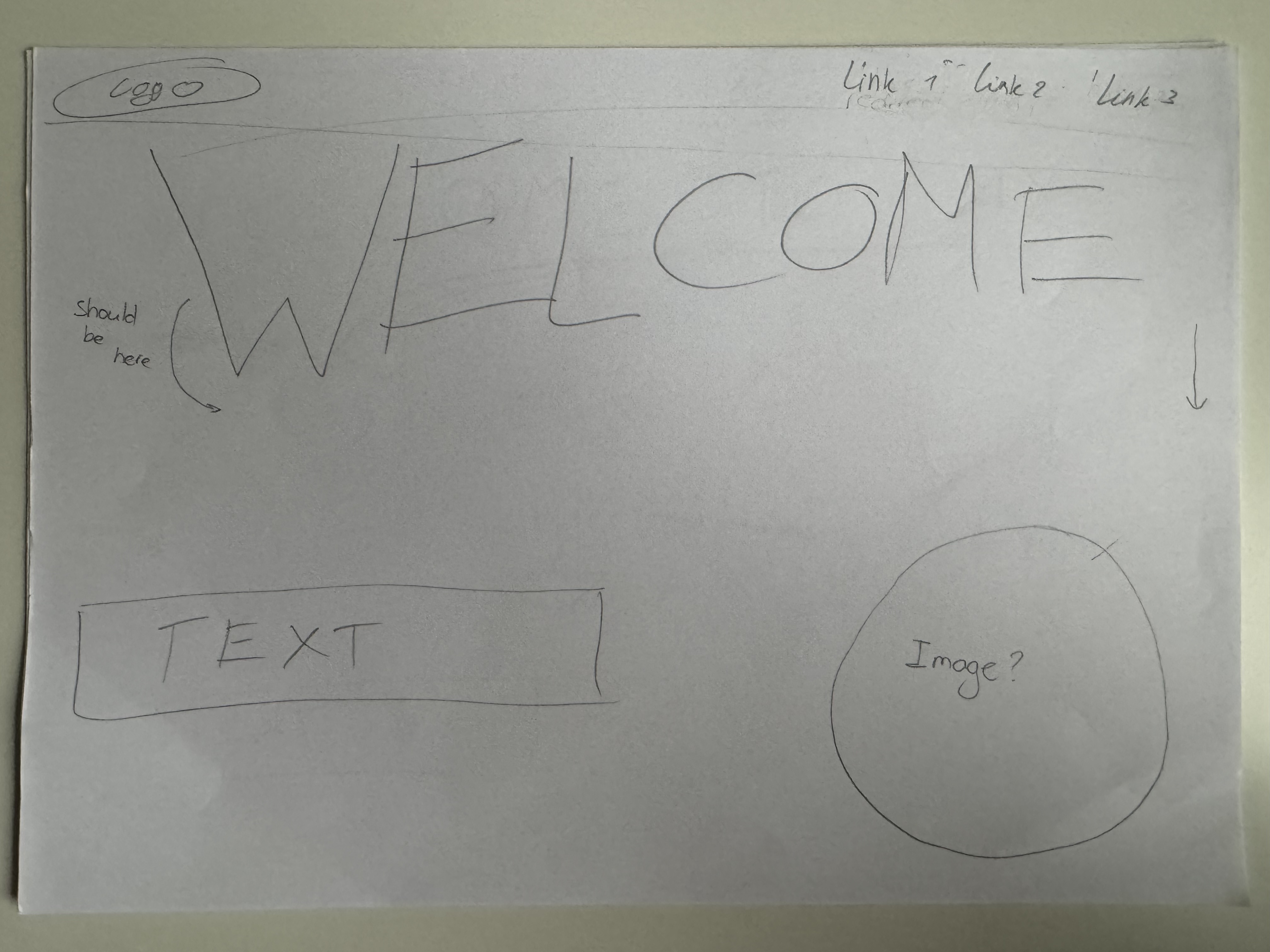
Sketch 1
Sketch 2
Sketch 3
Conclusion
Personally, I liked sketch 2 the most. As I can be more creative with it and it looks like it would catch the users attention the best.
Reflection
By making a sketch first I got a better idea of what I wanted to make/design. It also helped me seeing different approaches/ideas for the homepage. This really helped as I still wasn't entirely sure on how to start.
Context
I have performed an user test on one of my assesors for my portfolio, they were thinking aloud so that I know their thought progress. You can view the document here.
Reflection
After performing this user test, I found out that it's very important to do as it gives you a very good insight on how your target audience navigates through the website. It also helped to identify weak points of my website. However, I do wish that I had performed this earlier, as I forgot to perform one quite some time ago. If I did I could've improved the weak points that were seen during the testing.
Links:
This is the documentation & research PDF: (PDF)
This is the exported Figma: Figma (PDF)
Video file: MOV file
Reflection
I enjoyed working on this project but I didn't like the fact we didn't have a lot of time for this. As this was the only project you could choose your own 'theme' at. But for the rest it went pretty okay, as you can read my experience and journey in the documentation pdf above. I also loved the fact I could video edit as I love doing it.